Jonathan Jarvis created a series of animated shorts as a project for his work as a graduate student in the Media Design Program at Art Center College of Design. He started exploring the concept of system diagrams and integrated them into motion interactions.
The Crisis of Credit Visualized from Jonathan Jarvis on Vimeo.
(Note: Someone commented about the negative way the family who represents sub-prime mortgage holders was depicted in the short.)
Related Economic Sounds:
The short was influenced by information from the following "This American Life" radio broadcasts.
Click on the following links to listen to the broadcasts:
Another Frightening Show About the Economy
Transcript (pdf)
The Giant Pool of Money
Transcript (pdf)
More about Jonathan Jarvis:
Crisis of Credit Project Page
The back story behind Jonathan's work on the Crisis of Credit Project, with story board scenes and his research sketch of the Crisis of Credit system diagram.
Jonathan's Website
Jonathan's Global Storytelling Project (pdf)
Showing posts with label data visualization. Show all posts
Showing posts with label data visualization. Show all posts
Sunday, February 22, 2009


Sunday, February 1, 2009
Need for Interactive Infoviz for the Finance Biz, Business Leaders, Government Officials, Educators, and the Rest of Us (cross-post)
Here are some of my reflections...
As I write this post, leaders of the financial industry, large corporations, and governments are in Davos, Switzerland at the annual meeting of the World Economic Forum. It is interesting to note that all of these bright men and women are struggling to grasp the enormity of the world's financial crisis and come up with strategies that hopefully will work.
The graphic below depicts how much has changed in the world economy between the 2008 annual meeting of the World Economic forum and the present. It lacks the "wow" factor that one would expect for an application running on an interactive display. With some tweaking, it could be transformed into an application that supports two people interacting with the data at the same time.

(Click above photo to link to the interactive graphic.)

This makes sense.
There simply is too much data to absorb, explore, analyze, understand, and act upon. It is difficult to know if you have all of the data that you need, because some of it is difficult to access. It doesn't matter if you are a banker, a stock broker, a CEO, a CFO, a government leader, an economist, a shareholder, or a student. The current state of world economic affairs is the strongest evidence that our methods simply aren't working.
The work of Hans Gosling provides a good example of how information visualization can help increase our understanding of large quantities of data over time. Hans Gosling is a Swedish professor of development and one of the founders of Gapminder. ("Unveiling the beauty of statistics for a fact-based world view".)
The following video is Rosling's latest presentation, focused on debunking the myths regarding population growth:
What stops population growth? from Gapminder Foundation on Vimeo.
Rosling Explains: Global Economy, Income, and Decline of Poverty
Here are some thoughts:
I started keeping up with the current economic on a more serious level in October. I was becoming numb from information overload. My knowledge about the economic and financial fields was lacking, so I decided to create a blog that I entitled "Economic Sounds and Sights" as my personal on-line repository of searchable content.
The blog has lots of pictures, info-graphics, embedded video clips, and links to a wide range of web-based resources. In my quest for information, I came across interesting quotes, jokes about economists, and tales of greed and scandals. I even found one blogger who has responded to each unfolding event of our economic crisis by re-writing lyrics to popular tunes.
For an example of one of my posts, read "Celestial Economic Sphere, Data Viz for the Finance Biz..." It is my hope that the content I've collected and shared on the blog will become part of an interactive information visualization/timeline designed to support two or more people on a large display or table.
RELATED
Three Mirrors of Interaction: A Holistic Approach to User Interfaces (Bill Buxton)
Andreas Nicolas Fischer (Berlin-based artist who works with data, sculpture, and code.)
Google Spreadsheets Data Visualization Gadgets
Google Motion Chart (like Gapminder)
Panopticon
Death and Taxes (Wallstats.Com: The Art of Information)
2009 Index of Economic Freedom (Wall Street Journal and the Heritage Foundation)
Visual Business Intelligence Stephen Few's Blog
Sunlight Foundation
Transparency Timeline - A History of Congressional Public Access Reform
"The Sunlight Foundation is committed to helping citizens, bloggers and journalists be their own best congressional watchdogs, by improving access to existing information and digitizing new information, and by creating new tools and Web sites to enable all of us to collaborate in fostering greater transparency."
MapLight.org "Money and Politics: Illuminating the Connection"
Free Our Data Blog (Guardian Technology campaign for free public access to data about the UK and its citizens)
2009 Death and Taxes Interactive Graphic

Mark Lombardi
Take the time to listen to a Window Media audio file of NPR's Lynn Neary's interview with Robert Hobbs, curator of the an exhibit of the late Lombardi's "conspiracy" art/visualizations linking global finance and international terrorism. Lombardi's background as an archivist and reference librarian served him well in his art depicting interesting large-scale networks. Although his art was not interactive, his techniques have inspired the development of computer-based interactive information visualizations.
FYI:
To satisfy my curiosity about Mark Lombardi, I followed a link to "Obsessive-Generous": Toward a Diagram of Mark Lombardi, by Frances Richard, posted in the 2001-02 section of the WBURG website.
The examples below are of Lombardi's work connecting the relationships between George W. Bush, Harken Energy, and Jackson Stephens:

George W. Bush, Harken Energy and Jackson Stephens
c. 1979-90, 5th Version 1999

Close-up of network detail

Close up depicting a profit made by Bush, 2 weeks before Saddam Hussein invaded Kuwait
via Frances Richard
As I write this post, leaders of the financial industry, large corporations, and governments are in Davos, Switzerland at the annual meeting of the World Economic Forum. It is interesting to note that all of these bright men and women are struggling to grasp the enormity of the world's financial crisis and come up with strategies that hopefully will work.
The graphic below depicts how much has changed in the world economy between the 2008 annual meeting of the World Economic forum and the present. It lacks the "wow" factor that one would expect for an application running on an interactive display. With some tweaking, it could be transformed into an application that supports two people interacting with the data at the same time.
(Click above photo to link to the interactive graphic.)
Via the Wall Street Journal
Here are more examples related to the current economic crisis:

Annus Horribilis in 3D
Financial chart by artist Andreas Nicholas Fischer via Dan Pink

Life in the Left Tail
(click for a larger image) via Greg Mankiw's Blog: Random Observations for Students of Economics, via Daily Kos
I've been thinking about interactive information visualization and how it can support our understanding of the current economic crisis a bit lately, inspired by what I learned in Dr. Robert Kosara's InfoViz class I took last year. In a recent post on the Eager Eyes blog, Dr. Kosara floats the idea of the establishment of a "National Data Agency".Here are more examples related to the current economic crisis:

Annus Horribilis in 3D
Financial chart by artist Andreas Nicholas Fischer via Dan Pink

Life in the Left Tail
(click for a larger image) via Greg Mankiw's Blog: Random Observations for Students of Economics, via Daily Kos
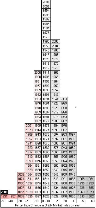
"On this chart each block represents a year and each column represents a range of return on the S&P index. Over on the right side are those lucky years where the index has soared upward from 50-60%. In the middle are the more typical years, where the market has risen less than 10%. That little box on the far left? Yeah, that's this year..And hey, how many of you knew the S&P had been around since 1825?." - Devilstower of the Daily KOS
"What we need is a National Data Agency (NDA). This agency would be tasked with collecting data that all other agencies collect and produce, and making it available in a central place and in electronic, machine-readable form. There could and should be a reasonable data presentation on its website, perhaps even a National Data Dashboard (showing data of interest like debt, spending, jobless rate, etc.). But the bulk of data analysis would be left to third parties: analysts, journalists, citizens (and also aliens like me). Easily available data would make for more insightful reporting, more informed decisions, and endless business opportunities." -Robert Kosara
This makes sense.
There simply is too much data to absorb, explore, analyze, understand, and act upon. It is difficult to know if you have all of the data that you need, because some of it is difficult to access. It doesn't matter if you are a banker, a stock broker, a CEO, a CFO, a government leader, an economist, a shareholder, or a student. The current state of world economic affairs is the strongest evidence that our methods simply aren't working.
The work of Hans Gosling provides a good example of how information visualization can help increase our understanding of large quantities of data over time. Hans Gosling is a Swedish professor of development and one of the founders of Gapminder. ("Unveiling the beauty of statistics for a fact-based world view".)
The following video is Rosling's latest presentation, focused on debunking the myths regarding population growth:
What stops population growth? from Gapminder Foundation on Vimeo.
Rosling Explains: Global Economy, Income, and Decline of Poverty
"Gapminder is a non-profit venture promoting sustainable global development and achievement of the United Nations Millennium Development Goals by increased use and understanding of statistics and other information about social, economic and environmental development at local, national and global levels. We are a modern “museum” that helps making the world understandable, using Internet."
The visual representation of economic data, if done well, packs a powerful punch. To me, images form a kernel in my memory related to the messages conveyed, and when recalled, also bring up a range of related conceptual details. It is sort of like what happens when I hear the first few notes of a tune from the past.
This doesn't seem to be the case for me when thinking about related text, or even thinking about "boring" charts and graphs.
This doesn't seem to be the case for me when thinking about related text, or even thinking about "boring" charts and graphs.
The world needs effective and efficient data and information analysis and interactive visualization tools in order to solve problems that are on such a colossal scale.
The use of collaborative gesture and multi-touch display systems for data and information visualization is something that I believe will support better methods of decision-making in a variety of fields. Now is the time for the interactive information visualization community and related disciplines such as interactive multimedia and HCI to assist in this effort.
Here are some thoughts:
- Those who are coding gesture-based or multi-touch programs need to understand what sort of content people will explore, and make sure that applications provide flexibility in use.
- Human-computer interaction specialists will need to continue the study a range of interfaces and interactions in order to determine what supports human cognition of larger amounts of data and information.
- Creators of interactive multimedia content, web developers, and others will need to re-examine their work and think about ways their content can support new ways of thinking and problem-solving within the context of "surface" computing.
- Computer Supported Cooperative Work researchers will need to figure out what needs to be in place so that information can be effectively shared and analyzed between pairs or teams of people, and how this information can best be communicated to others within a business, agency, or organization, as well as the public.
One of the challenges facing this effort is that few people have an in-depth understanding of what it will take to make it happen. We will need to take an inter-disciplinary effort requiring a much higher level of communication and collaboration between people not accustomed to working within this context.
We will also need to take a "big picture" approach.
Because of the world's economic crisis, I think that interactive information/data visualization applications should target the needs of people who are working to understand the crisis and who have the power to do something constructive about it. This can not happen if they rely on the models and data analysis techniques of our recent past.
At the same time, these tools should be available to the rest of us, via the Internet, so that we may do our part to move us forward.
Back Story:
We will also need to take a "big picture" approach.
Because of the world's economic crisis, I think that interactive information/data visualization applications should target the needs of people who are working to understand the crisis and who have the power to do something constructive about it. This can not happen if they rely on the models and data analysis techniques of our recent past.
At the same time, these tools should be available to the rest of us, via the Internet, so that we may do our part to move us forward.
Back Story:
The blog has lots of pictures, info-graphics, embedded video clips, and links to a wide range of web-based resources. In my quest for information, I came across interesting quotes, jokes about economists, and tales of greed and scandals. I even found one blogger who has responded to each unfolding event of our economic crisis by re-writing lyrics to popular tunes.
For an example of one of my posts, read "Celestial Economic Sphere, Data Viz for the Finance Biz..." It is my hope that the content I've collected and shared on the blog will become part of an interactive information visualization/timeline designed to support two or more people on a large display or table.
RELATED
Three Mirrors of Interaction: A Holistic Approach to User Interfaces (Bill Buxton)
Andreas Nicolas Fischer (Berlin-based artist who works with data, sculpture, and code.)
Google Spreadsheets Data Visualization Gadgets
Google Motion Chart (like Gapminder)
Panopticon
Death and Taxes (Wallstats.Com: The Art of Information)
2009 Index of Economic Freedom (Wall Street Journal and the Heritage Foundation)
Visual Business Intelligence Stephen Few's Blog
Sunlight Foundation
Transparency Timeline - A History of Congressional Public Access Reform
"The Sunlight Foundation is committed to helping citizens, bloggers and journalists be their own best congressional watchdogs, by improving access to existing information and digitizing new information, and by creating new tools and Web sites to enable all of us to collaborate in fostering greater transparency."
MapLight.org "Money and Politics: Illuminating the Connection"
Free Our Data Blog (Guardian Technology campaign for free public access to data about the UK and its citizens)
2009 Death and Taxes Interactive Graphic

Via Stephen Few: Example of Horizon Graphs, developed by Panopticon. (Year's worth of prices of 50 stocks in 2005 and comparisons between them, click to enlarge)
Mark Lombardi
Take the time to listen to a Window Media audio file of NPR's Lynn Neary's interview with Robert Hobbs, curator of the an exhibit of the late Lombardi's "conspiracy" art/visualizations linking global finance and international terrorism. Lombardi's background as an archivist and reference librarian served him well in his art depicting interesting large-scale networks. Although his art was not interactive, his techniques have inspired the development of computer-based interactive information visualizations.
FYI:
To satisfy my curiosity about Mark Lombardi, I followed a link to "Obsessive-Generous": Toward a Diagram of Mark Lombardi, by Frances Richard, posted in the 2001-02 section of the WBURG website.
The examples below are of Lombardi's work connecting the relationships between George W. Bush, Harken Energy, and Jackson Stephens:

George W. Bush, Harken Energy and Jackson Stephens
c. 1979-90, 5th Version 1999
Close-up of network detail
Close up depicting a profit made by Bush, 2 weeks before Saddam Hussein invaded Kuwait
via Frances Richard
"...though he possessed the instincts of a private eye and the acumen of a systems-analyst, Lombardi was of course an artist, and from the raw material of wire-service reports and books by political correspondents, he drew not only chronicles of covert, high-stakes trade, but technically pristine and sensually compelling visual forms"-Frances Richard
Tuesday, November 4, 2008
Unemployment and Presidential Elections 1980-2008, via Visualizing Economics, with link to Bureau of Labor Statistics Interactive Map
Via Visualizing Economics
Bureau of Labor Statistics Interactive Map


Thanks to Catherine Mulbrandon for the screenshot and link!
Related:
The U.S. Bureau of Labor Statistics website contains a wealth of information, including interactive graphics. There are "at a glance" tables, databases & tables, maps, calculators related to inflation, location quotient, injury and illness, an area where you can create customized maps, and more.
It even has an interactive career information section for kids.

Note: Click the above picture to get to the next screen. From there, if you click on the text bubbles, you will be linked directly to additional information and resources about the specific areas of employment.
Bureau of Labor Statistics Interactive Map

Thanks to Catherine Mulbrandon for the screenshot and link!
Related:
The U.S. Bureau of Labor Statistics website contains a wealth of information, including interactive graphics. There are "at a glance" tables, databases & tables, maps, calculators related to inflation, location quotient, injury and illness, an area where you can create customized maps, and more.
It even has an interactive career information section for kids.
Note: Click the above picture to get to the next screen. From there, if you click on the text bubbles, you will be linked directly to additional information and resources about the specific areas of employment.
Friday, October 10, 2008
Links to Data and Information Visualization Resources for Economics, Finance, and the Current Crisis
If you are interested in learning more about data and information visualization, in light of our current economic crisis, take the time to explore the following links. This list is just a start!
(Warning: A few of the links have a political slant, in one way or another.)
Wikipedia: Visual Analytics
Robert Kosara: Eager Eyes
Nathan Yau: Flowing Data
Nathan Yau's post: Great Data Visualization Tells a Great Story
IBM: Many Eyes
"Many Eyes is a bet on the power of human visual intelligence to find patterns. Our goal is to "democratize visualization and to enable a new social kind of data analysis."
Visual Complexity
Meryl.Net: 175+ Data and Information Visualization Examples and Resources
Death and Taxes 2009 : A Visual Guide to Where Your Federal Tax Dollars Go (from WallStats
: The Art of Information)
Aaron Schiff: 26econ.com
Aaron Schiff's post: Building Interactive Economic Models with Excel
Aaron Schiff's Economic Blog Directory and Rankings
They Rule: Create maps of the interlocking directories of the top US companies from 2004
Hans Rosling and GapMinder
Gapminder World Blog
Hans Roslinger's Gapminder Ted Talk video
Barry Ritholtz: The Big Picture: Macro Perspective on the Capital Markets, Economy, Geopolitics, Technology, and Digital Media
Follow the Oil Money (Interactive chart that provides views of companies, politicians, and relationships)
Presidential Watch 08: A Map of the Political Blogosphere
Enron E-Mail Explorer
Economic Data Resources
Economic Indicators.Gov
Economic Statistics (Whitehouse)
US Bureau of Economic Analysis, U.S. Department of Commerce
The World Bank
The International Money Fund Data and Statistics

IMF Data Animation, October 2008
(Warning: A few of the links have a political slant, in one way or another.)
Wikipedia: Visual Analytics
Robert Kosara: Eager Eyes
Nathan Yau: Flowing Data
Nathan Yau's post: Great Data Visualization Tells a Great Story
IBM: Many Eyes
"Many Eyes is a bet on the power of human visual intelligence to find patterns. Our goal is to "democratize visualization and to enable a new social kind of data analysis."
Visual Complexity
Meryl.Net: 175+ Data and Information Visualization Examples and Resources
Death and Taxes 2009 : A Visual Guide to Where Your Federal Tax Dollars Go (from WallStats
: The Art of Information)
Aaron Schiff: 26econ.com
Aaron Schiff's post: Building Interactive Economic Models with Excel
Aaron Schiff's Economic Blog Directory and Rankings
They Rule: Create maps of the interlocking directories of the top US companies from 2004
Hans Rosling and GapMinder
Gapminder World Blog
Hans Roslinger's Gapminder Ted Talk video
Barry Ritholtz: The Big Picture: Macro Perspective on the Capital Markets, Economy, Geopolitics, Technology, and Digital Media
Follow the Oil Money (Interactive chart that provides views of companies, politicians, and relationships)
Presidential Watch 08: A Map of the Political Blogosphere
Enron E-Mail Explorer
Economic Data Resources
Economic Indicators.Gov
Economic Statistics (Whitehouse)
US Bureau of Economic Analysis, U.S. Department of Commerce
The World Bank
The International Money Fund Data and Statistics
IMF Data Animation, October 2008
Catherine Mulbrandon's Visualizing Economics Blog
In my quest to become better-informed in topics related to finance and economics, I came across the Visualizing Economics blog. The author/designer of this blog is Catherine Mulbrandon. She has a degree in economics from the University of Chicago, and a graduate degree in Interaction Design from Carnegie Mellon, focusing on information and interaction design.
Not until I took a class in information visualization did I fully appreciate the importance of this way of understanding, interpreting, and sharing data.
Catherine's "Manifesto" explains why this is important:
Not until I took a class in information visualization did I fully appreciate the importance of this way of understanding, interpreting, and sharing data.
Catherine's "Manifesto" explains why this is important:
-
I believe design can contribute to public debates by creating information-rich, easy-to-understand graphics revealing the meaning of data without hiding its complexity. While the Internet allows even greater access to economic data than ever before, much of it is hidden in databases, spreadsheets and academic papers. At the same time, the discussion of economics in the media can be confusing and contradictory. Often numbers are quoted out of context, while political agendas distort the presentation of economic data. The goal of this site is to help people who are interested in the subject of economics (but are not experts) to understand and participate in public discussions about economics through data visualizations.
Subscribe to:
Posts (Atom)